Creating a memorable brand for an ed tech startup
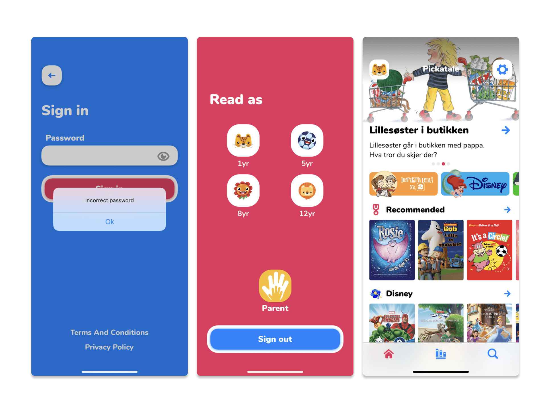
Pickatale is a Norwegian ed-tech start up which was launched in 2014. The goal of Pickatale as a start up was to focus on creating an engaging reading app for children throughout Western Europe - something that could be used both within the context of home and school.
Some statistics around Pickatale and their products
Of the 5690 teachers, only 6% were considered active users. The majority of the school accounts were based in the UK, whereas our parental audience were mostly in Scandinavia.
60k
Users are parents
5690
Users are teachers
80%
based in NO
39041
Student accounts
Project Goals
To kick off our project, we knew we wanted to do the following:
Understand our users
Align the two brands into one
Deliver a new website
Rebrand our software
Gathering our insights
Customer journey mapping We uncovered that between the NO and UK market, NO schools are much more organised for what software will be introduced in schools.
Teacher and Parent interviews Around 20 teachers across the UK, NO and DK had already been interviewed by Feb 2022 - but no Parents. Our external researcher interviewed 15 parents.
Competitor analysis We analysed competitors to understand how they marketed themselves and how they positioned themselves (serious, plalyful, etc).
After a few workshops, we began to understand as a team how we wanted to see ourselves going forward in comparison to our competitors: a combination of being playful, trustworthy and credible which were terms we had repeatedly heard from our usability studies with teachers and educators. As our interviews were starting at this time (February 2022) the same terms were also coming from parents. Both groups were keen that the children using this app would have their data protected, they would have access to age appropriate content while also learning and being entertained.
From our workshops, we also summarised how we wanted to look based on a few mood boards and took it from there. Interestingly, a lot of our competitors used the colour blue and primary colours as well - but we wanted to see how could we appeal to our age group of 6+ years, while somehow referencing Pickatale's Norwegian heritage?
Our inspiration
We had a number of moodboards we narrowed it down to, but ultimately this one began to help us shape our path forward
Here are a few examples of the elements we started to look at in our branding journey
Information architecture
To get started on our IA, we worked with an external SEO agency who reviewed our current site and provided an idea for the ideal IA that would drive traffic and make it easy for educators and parents to find what they needed. We reviewed their concept as a team (myself, product managers, engineering) and decided that in order to reach our goal of April 2022 for a deliverable website, we would amend their suggestion and I created a revised IA.
To get started on our IA, we worked with an external SEO agency who reviewed our current site and provided an idea for the ideal IA that would drive traffic and make it easy for educators and parents to find what they needed. We reviewed their concept as a team (myself, product managers, engineering) and decided that in order to reach our goal of April 2022 for a deliverable website, we would amend their suggestion and I created a revised IA.
I worked with one of the designers on our team to create a prototype, and we tested the website with 20 teachers and 15 parents over the course of 1 week in March (our in house researcher led the interviews).
Thankfully, the branding was really well received by both parents and teachers, and a few teachers remarked that they like the steer away from primary colours - it seemed more educational but still engaging enough for children.
The main takeaways from testing:
Pricing plan was not obviously placed
Product purpose not clear
Too much empahsis on Disney content
Launching the site
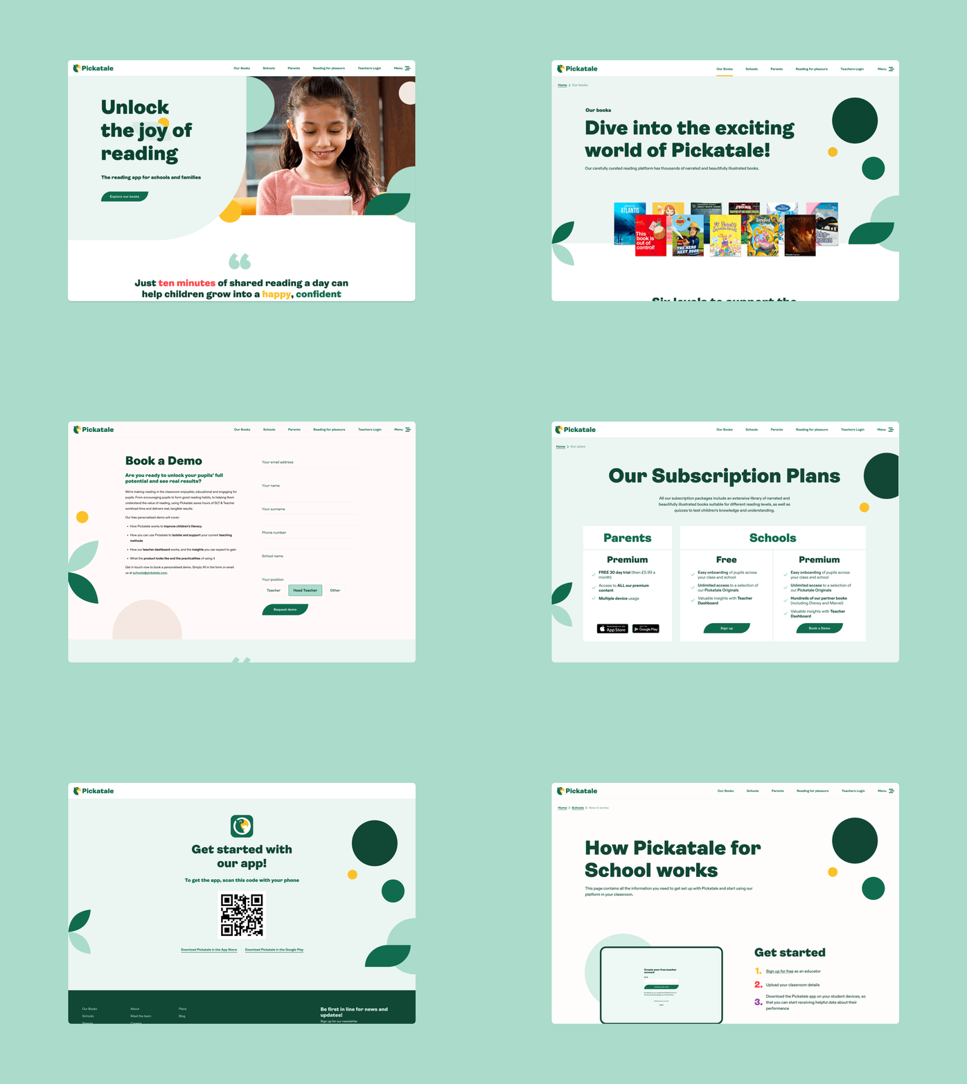
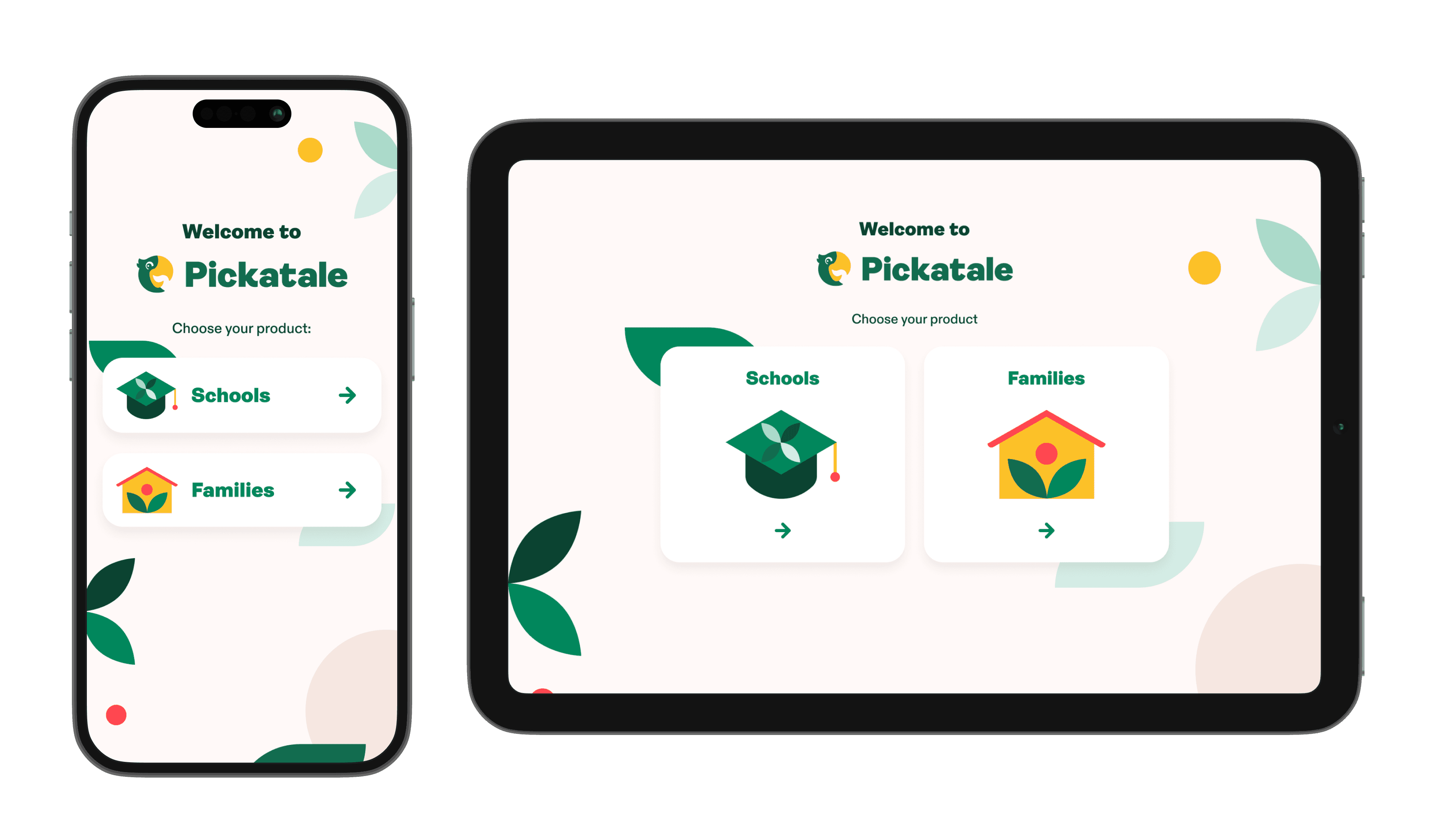
After lots of iterations and testing from that week in March, the site was launched in April 2022. This was a huge team effort, and the immediate next phase after we had launched the website was to begin an MVP update of our products to matchthe new branding.
Reflections
I would have to say this was probably the most tumultuous project I've ever worked on, but I'm also super proud of where it ended up despite the unpredictability. This project was also especially hard because I was pregnant throughout the process, so it was very difficult and at times impossible to strike a balance between being pragmatic and knowing when to 'turn off' from work because of the tight timeline.
The website can now be viewed here, and the next steps (at that time) were to create a design system with the new elements from our branding guidelines.
Unfortunately, I was not able to return to Pickatale after the birth of my son due to being laid off from Pickatale in October 2022.


