How to unify a suite of products through a cohesive navigation system
Fourth provides customers with a number of applications to perform various hospitality functions such as receiving their goods or counting their stock.
Background
Fourth also provides customers with HR solutions like viewing payslips and requesting holiday time. The issue is - these functions exist in separate applications and when a user enters one of these applications, i.e., Stock Count, they are unable to navigate to another application because our navigation system does not allow for this behaviour.
To put this into perspective, Fourth roughly offers about 10 applications that could be used possibly by a hotel or restaurant on a daily basis. Imagine having to login through a single sign on, navigating to an application and then being unable to leave that application for another which contains the next action you’d like to do…not a great experience, is it?
Bringing logic to chaos
As product managers and owners began to realise the impracticality of the situation, I was asked to review, research and find a solution that could lead to a global navigation for the Fourth application family.To get started I created use cases from both a Head Chef and General Manager point of view and then reviewed the use cases with the Lead Designer on my Team. With the use cases completed, I then researched the various actions available from all of the 10 applications that could have ‘connections,’ or opportunities for users to want to jump from one application to another.
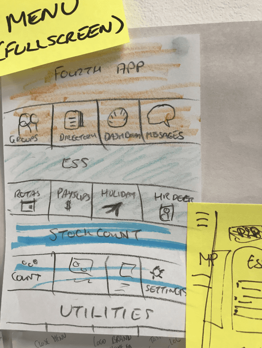
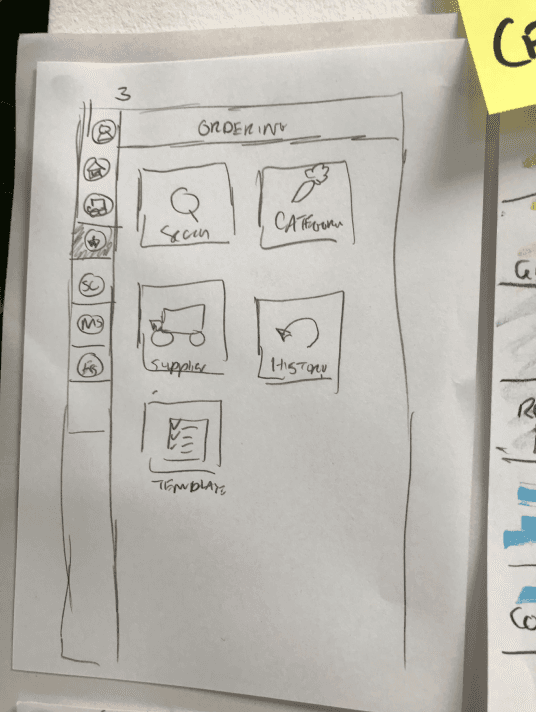
I started out scribbling out all of the various apps we had, their actions, and the potential 'jump-off' points one app could have into another. This exercise was to understand which apps belong into more closely related families - i.e., a chef will probably bounce from the stock counting app into the ordering app once they realise that they're low on a particular product.
Testing the new UI
After I created two different prototypes (traditional side drawer view, springboard view) the was result from internal testing was that people found it easier to navigate with a springboard UI. With this in mind, I wanted to set up a date with testing a more refined prototype with the real end user, i.e. - the everyday people that work in hotels and restaurants.
With some luck I reached out a representaive of a large hotel chain who was excited to partake in the testing of the new prototype. I refined the prototype to meet the business goals of allowing users to navigate smoothly between applications, but also updated the visual design to promote a unified look across our applications.
After testing the various concepts with 4 participants and also discussing the current software that was in use at Staybridge Suites with the hotel’s general manager, the overwhelming testing winner was Design 1.
When we shared our results with the product owners and CTO of Fourth, we received some additional feedback to the UI of the menu (which was pretty minor).
What's next
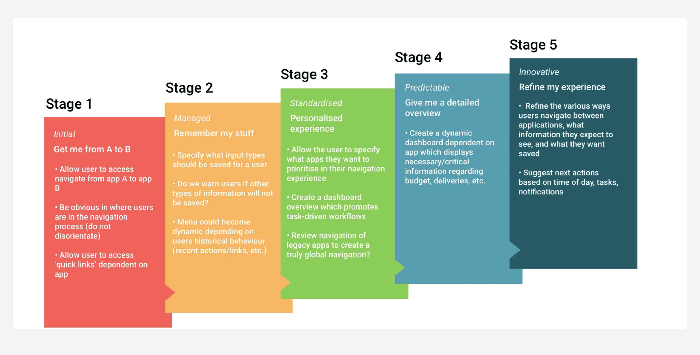
After considering how the new designs will be implemented, the need to clean up our hierarchy and group apps together based on need and relativity, I created a set of steps that we need to follow in order to successfully see the new navigation be brought to life for our users.


