Improving the eSIM purchasing experience
Airalo is a telecomm startup that has provided the world’s first eSIM store, allowing travellers to purchase the relevant eSIM card that they can download and install on their phone before or after they arrive in their travel destination.
I worked briefly with Airalo as a Senior Product Designer and focused on improving their interface for customers on both web and mobile.


Company
Airalo
Timeframe
Feb - Mar 2023
Role
Senior Product Designer
Industry
Telecomms
Background
During my time with Airalo, I helped out with refining the UI on a few journeys: Clarifying data breakdown on the Airalo website so customers have a clearer idea of what exactly is included in their package, and I also worked on offline mode.
For offline mode, customers could find themselves abroad, able to access the Airalo app but unable to activate their eSIM if their wifi is shaky. So, I worked with the engineering team to mock up a few ideas on how to address this.
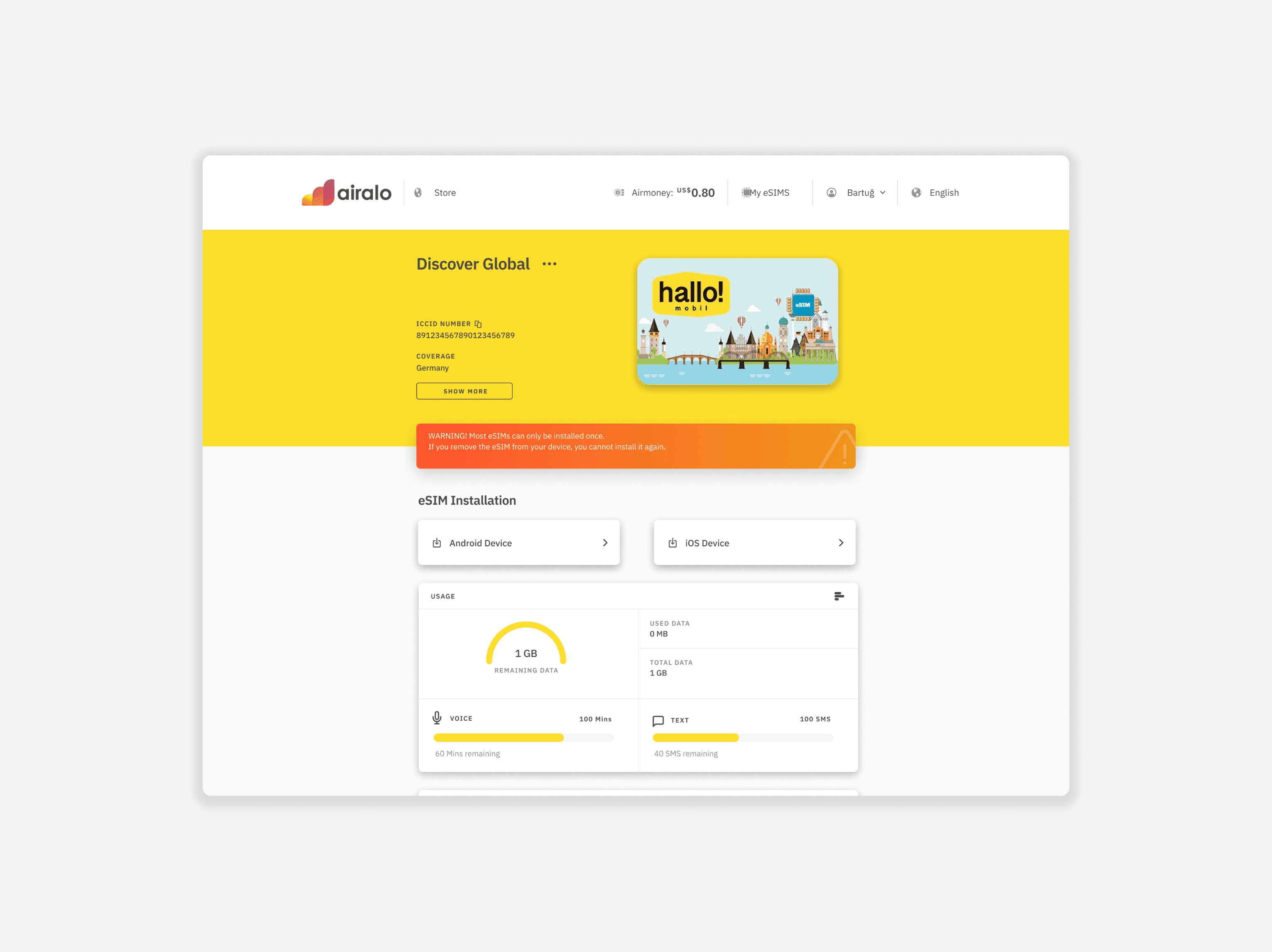

Data usage breakdown
On the Airalo website, we provide hundreds of package deals for eSIM cards for various countries and regions. For this particular part of the site, my role was to design the usage breakdown and display how voice and text is used in package deals.
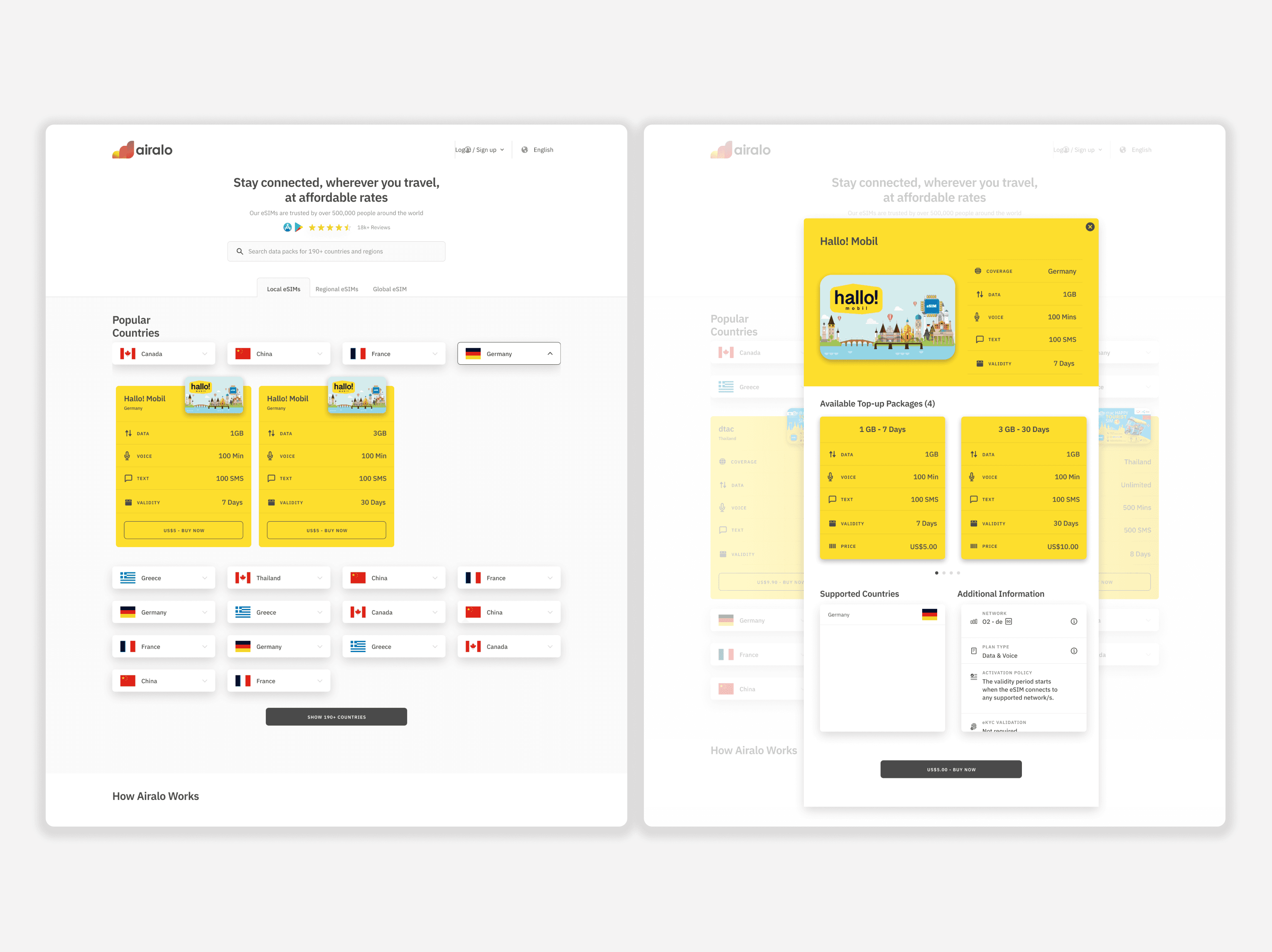

Offline mode
With the Airalo app, customers can either install their eSIM card before or after they arrive in their destination. Unfortunately, with our data and customer feedback the product team had collected enough information that customers were arriving in their destination countries only to find that the WiFi was poor, and they were unsure of how to install the eSIM card - because the instructions were only accessible IF they have WiFi.
Our engineering team looked into how we could get around this problem - and what information we could potentially cache so that if customers were offline, they could still at least have access to some parts of the app. Between myself and the engineering team, we began to work on a few different user flows.
Working through the flows
Reviewing and working through the user journey of when a customer is offline ended up bringing up more questions than answers - for example, if a customer is offline - why would they want to read all of the information of setting up an eSIM?
As a new designer to the team, I realised how text heavy the set up was and it seemed unrealistic to expect a customer who is travelling to need extra headspace for how to set up something that could be very technical and time consuming.
I expressed my doubts about how we might be overcomplicating this journey to the engineering team, and we went to the other extreme of a very simplified offline mode journey.


Understanding our limitations
There were a lot of things that myself and the mobile engineer uncovered as we worked through this offline mode journey. As we were both new to the company, we also learned about the different between the instruction types and ways to access eSIM instructions. We understood that we could in fact cache the UI of the different card UI for packages, but in terms of what we could show on the package UI, it was minimal.
This was the MVP for the offline mode journey, and from that point we wanted to understand what else could we retain for customers during offline mode so that they won't be totally stranded if they are attempting to install or activate an eSIM card.


Company
Airalo
Timeframe
Feb - Mar 2023
Role
Senior Product Designer
Industry
Telecomms
Background
During my time with Airalo, I helped out with refining the UI on a few journeys: Clarifying data breakdown on the Airalo website so customers have a clearer idea of what exactly is included in their package, and I also worked on offline mode.
For offline mode, customers could find themselves abroad, able to access the Airalo app but unable to activate their eSIM if their wifi is shaky. So, I worked with the engineering team to mock up a few ideas on how to address this.


Data usage breakdown
On the Airalo website, we provide hundreds of package deals for eSIM cards for various countries and regions. For this particular part of the site, my role was to design the usage breakdown and display how voice and text is used in package deals.


Offline mode
With the Airalo app, customers can either install their eSIM card before or after they arrive in their destination. Unfortunately, with our data and customer feedback the product team had collected enough information that customers were arriving in their destination countries only to find that the WiFi was poor, and they were unsure of how to install the eSIM card - because the instructions were only accessible IF they have WiFi.
Our engineering team looked into how we could get around this problem - and what information we could potentially cache so that if customers were offline, they could still at least have access to some parts of the app. Between myself and the engineering team, we began to work on a few different user flows.
Working through the flows
Reviewing and working through the user journey of when a customer is offline ended up bringing up more questions than answers - for example, if a customer is offline - why would they want to read all of the information of setting up an eSIM?
As a new designer to the team, I realised how text heavy the set up was and it seemed unrealistic to expect a customer who is travelling to need extra headspace for how to set up something that could be very technical and time consuming.
I expressed my doubts about how we might be overcomplicating this journey to the engineering team, and we went to the other extreme of a very simplified offline mode journey.


Understanding our limitations
There were a lot of things that myself and the mobile engineer uncovered as we worked through this offline mode journey. As we were both new to the company, we also learned about the different between the instruction types and ways to access eSIM instructions. We understood that we could in fact cache the UI of the different card UI for packages, but in terms of what we could show on the package UI, it was minimal.
This was the MVP for the offline mode journey, and from that point we wanted to understand what else could we retain for customers during offline mode so that they won't be totally stranded if they are attempting to install or activate an eSIM card.
Improving the
eSIM purchasing experience
Airalo is a telecomm startup that has provided the world’s first eSIM store, allowing travellers to purchase the relevant eSIM card that they can download and install on their phone before or after they arrive in their travel destination.
I worked briefly with Airalo as a Senior Product Designer and focused on improving their interface for customers on both web and mobile.